 Ana Castrillon

CPaaS is a powerful way to unify your communications, offer improved customer service experiences, cut costs, and scale your business effectively.
“Are we confusing, or worse – alienating – prospective customers with a brand image that’s not reflecting our real capabilities?”
This was the hard question I asked myself 18 months ago.
Looking back on things, it all began with a single phone call between one of our sales team and a prospect. Like many other customers, they had a sense that Toku did things differently from the local incumbents in the APAC telco scene, and we had some strengths that international cloud comms players with a presence in the region did not.
But beyond that, things got hazy. And even though the prospect liked our USPs and ultimately became a customer, the conversation stuck with me.
The fact is the prospect came into the conversation thinking of us as a telco player. They were not aware how Toku had evolved a full-fledged customer engagement solution built on an infrastructure of cloud contact centre technology and modern APIs.
As a young company, we are always iterating and refining our product and pitch. But what if, as we developed the solutions and the positioning, our brand was being left behind?
I realised, from that phone call and others like it, that the image of Toku we were projecting was a snapshot of where the company was three years ago – not what it had become. It was real evidence that our brand image was confusing would-be customers, and possibly alienating them.
Our offerings, position in the market and USPs had all changed, and our brand needed to change too.
So to ensure it did the legwork of showcasing our robust suite of cloud communications solutions, we set out on an ambitious rebranding journey.
In this article, I want to share that journey with you and:
- Reveal some interesting insights,
- Deep dive into our fresh new look and feel, and
- Discover how it will serve the company and its customers
Let’s begin.
A journey of a thousand miles begins with a single step research
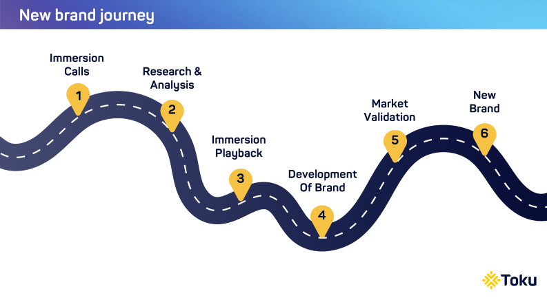
And I mean – LOTS of research.
As anyone who has gone through a rebranding process can testify, this phase is crucial to understanding the current perception of the brand and identifying the key areas that need improvement.
We undertook a thorough analysis of our target audience and the overall market.
This involved a comprehensive approach to gather information and insights, which involved various methods such as conducting customer surveys and interviews to understand their needs and preferences, analyzing industry reports to stay updated on market trends and developments, holding management interviews to gather insights from industry experts, and conducting employee surveys to assess their opinions and gather valuable feedback.
All these methods were used to gather a diverse range of perspectives and information, ensuring a thorough and well-rounded understanding of the subject matter.
We also reviewed the brand’s current messaging, visual identity, and overall positioning in the market. All this would prove invaluable in informing the development of our new brand’s visual identity and messaging.
Other questions we asked in our research:
- What are the unique attributes and features in our offering?
- What are the benefits we bring to our customers?
- Who cares about our product?
- What is the target market context and category?
- What are the prevailing market trends?
The more we analysed, the more challenges and opportunities we unearthed.
A company is more than just its products
One of the key challenges evident from our research was:
Toku needed a more consistent story we can anchor to while interacting with prospects and customers.
Being unable to tell the brand’s story cohesively had a major implication for our team when speaking with prospects – conversations sometimes circle endlessly around the product features without any emotional resonance.
This simply would not do, because the company is more than just our products – we are reimagining customer experiences and elevating them to new heights.
In fact, we discovered in our research that many customers felt a spark in our conversations. In every instance when this happened, the dialogue went in a totally new direction that excited both customers and us.
Customers started to reimagine their customer journeys in ways they never did before. And they quickly realised they could transform their customer experience with our solutions.
The spark thus became the foundation of our story.
Spark defining conversations – our new brand tagline
The tagline resonated so well with both customers and ourselves, that we knew this was the beginning of a story we could confidently own at Toku.
More importantly, the story elevated our conversations beyond discussions of product feature sets to something with personality that connected emotionally with people.
The spark encapsulates 4 key learnings from our research.
- Toku employees and customers are proud of how agile, energetic and flexible we are.
- Our customers acknowledge that we are innovative and brave.
- As Toku is a scaleup, the spark of innovation is central to who we are as a brand
- The idea prepares Toku for future shifts
‘Spark defining conversations’ also dovetailed well with another of our research findings:
It was these conversations that helped customers Reimagine their Customer Experience using our solutions.
A new manifesto we live and breathe
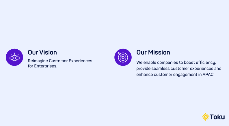
Whether it’s our website, social media posts, or other collateral, you can look forward to a fresh, energised feel that is guided by our new Vision, Mission, and Positioning.

Get monthly nuggets of wisdom for all things customer experience in your inbox
Let’s break down some of the new brand elements and see how we have incorporated the values in them.
New logo, ready to go!
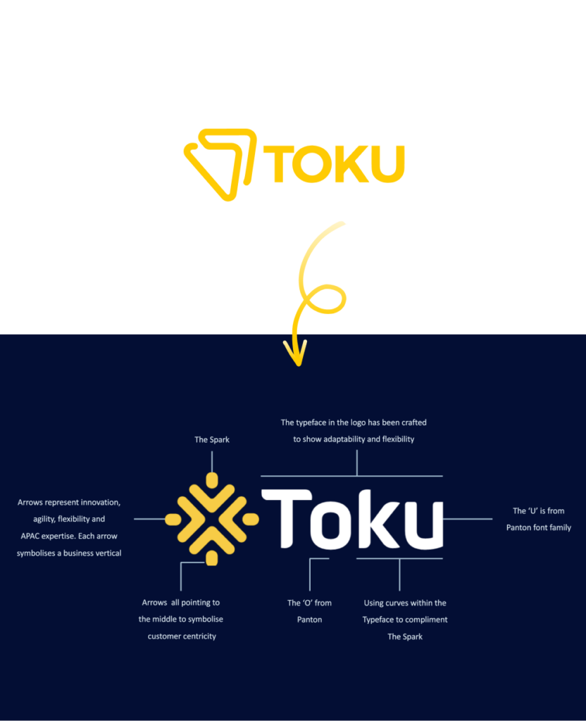
Toku’s previous logo was designed to resemble an antenna, emphasising our telco roots.
With the new logo, we see it’s now evolved into not just one, but four arrows facing inward towards the heart of all that we do – our customers. The arrows combine to form the Toku Spark, a tacit nod to how we enhance value through every conversation.
The fact that we have four arrows now instead of just one, reflects how we have evolved beyond being ‘just a telco player’ into a leading brand with multiple offerings for large scale enterprises, including Toku Telco Connectivity, Toku Communications API, Toku Contact Centre and Toku Business Telephony Solutions.
A brand-new visual ecosystem to showcase our lively personality
Along with a new brand, comes a new slate of colours to bring Toku’s communication to life.
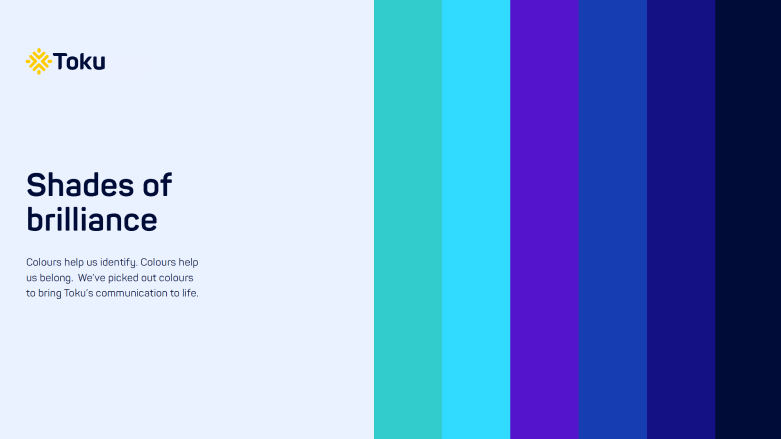
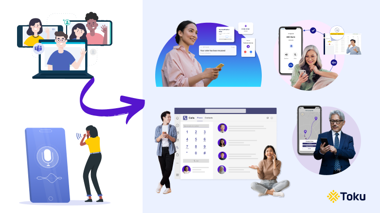
We’re also pivoting to a more human approach in our visuals.
Whereas our previous branding leaned towards illustrations in the “corporate” or “big tech” art style, the new Toku brand eschews this in favour of photography focusing on our customers.
The overarching goal?
A combination of colours and visuals that radiate positivity and cheerfulness. We want customers to feel more connected to us, because we look more human.
Building a customer-obsessed user experience
We have totally revamped and reorganised the way we speak about our products on the website and solutions, keeping in mind how our customers actually utilise them in real life.
This goes beyond new messaging and visuals, and into questions of user experience (UX) – such as how we help users find the information they need on our website.
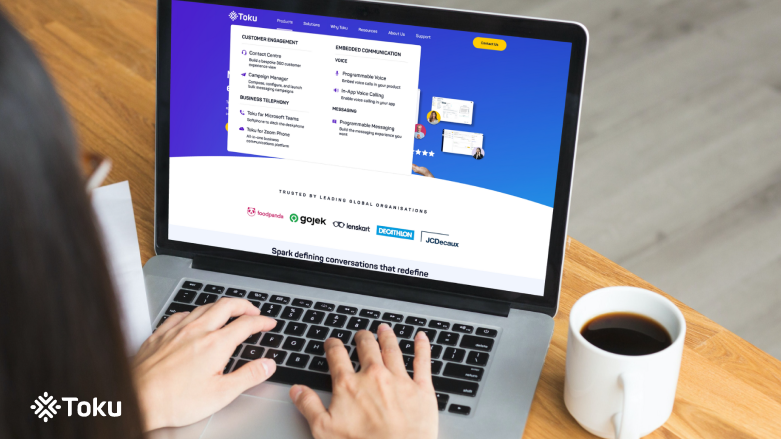
Navigating the Toku website
For example, instead of placing our communication API solutions under a “Programmable Communications” category, we now refer to these as “Embedded Communication” solutions.
This is because customers literally ‘embed’ these voice and messaging solutions into their platforms to extend the functionality and utility of their product.
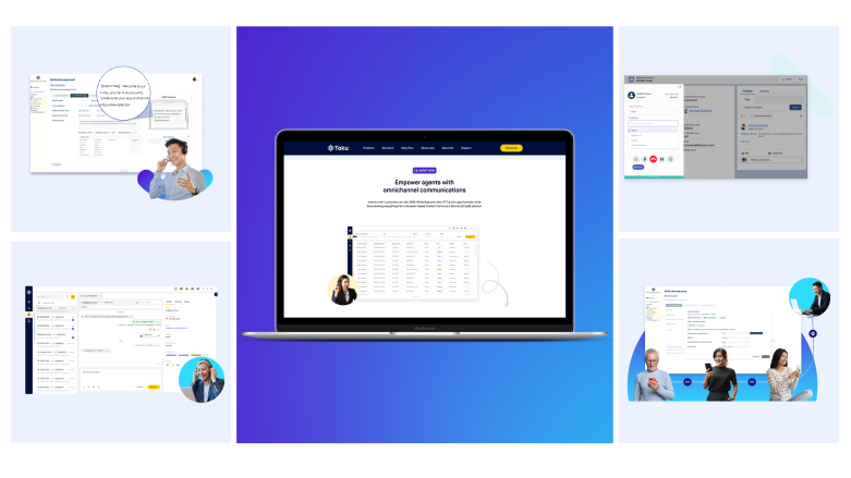
We also understood that many of our cloud communication solutions are highly complex and technical in nature. Customers may not immediately ‘understand’ them.
As such, there was a need to put the products themselves more front and centre so that prospects can better visualise how they will benefit from using them.
You will also notice that aside from the more comprehensive navigation menu and repositioning of our products, we have added several new Solutions pages, organising them by industry and use case.
The goal: Remove the guesswork and show readers exactly how our solutions can be applied within verticals relevant to their own.
Toku blog: the one-stop-shop for reimagining customer experiences
The Toku blog has been a labour of love right from the company’s inception.
Now that we have over 80 thoughtful pieces of content helping readers reimagine customer experiences (and we’re still adding more!), we realised users might need a little help finding their way around the blog.
An endless scroll of blog posts with no section breaks to give readers a breather, did not seem like a good reading experience to us.
Which is why the new Toku blog comes with an Essential Reading section, and a dedicated section with our product offerings.
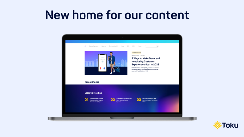
The goal: Deliver helpful, ‘must-read’ articles to new readers quickly, and familiarise qualified prospects with the products and solutions they need.
Reimagining the Toku brand as we evolve
As mentioned earlier, the company’s brand is a living, breathing story – one that will continue to change with time. Even as Toku helps our clients reimagine more seamless customer experiences, we are always thinking about how to evolve newer solutions and the best ways to bring these to an ever-shifting market landscape.
You can look forward to more evolutions in our brand, particularly on our website!
We’re just getting started with the launch of our new brand, and we plan to roll out some new pages and sections phase by phase.
Here’s to a new brand, new positioning, and new offerings that Spark Defining Conversations.
 Nora Huin
 V K Sanjeed